# A Deep Dive into Contrast Themes
Contrast Themes (aka "forced-colors") are a step users take beyond using sites' Light or Dark mode. Learn what they do, why they're used, how to test your site, and how to improve your site for when they're used.
May 20, 2026
[ Curtis Wilcox ](/people/curtis-wilcox)
## What are Contrast Themes?
Formerly called Windows High Contrast Mode (WHCM), Contrast Themes is a feature in Windows that replaces and simplifies all the colors used by the operating system, applications, and websites (this article will focus on websites). This is different from light/dark modes (aka "color schemes") which indicate what a user prefers but leaves the color choices up to the site author.
Windows 11 'Dusk' Contrast Theme.## Who do they help?
- People with different forms of **low vision** rely on having sufficient contrast to read text and see important user interface elements. Light-on-dark text (or dark-on-light) is easier to read for some people. Often a contrast theme will be used in addition to page zooming or screen magnification.
- People with **light sensitivity**, due to migraines, a traumatic brain injury, or other reasons may find a dark contrast theme easier to look at for longer periods of time.
- The consistency and simplification of interfaces may also help some people with other **cognitive disabilities**.
Web Content Accessibility Guidelines (WCAG) don't include any criteria that require sites to work with contrast themes enabled. Even so, meeting WCAG is "the floor, not the ceiling" for making sites accessible and Contrast Themes are a feature people with disabilities use to make sites more usable.
## Why test
Even if your site has good color contrast, has light and dark color schemes, etc., contrast theme users will likely have their theme enabled when they visit your site and not know about your site's defaults. It's worthwhile to check if your site has usability problems when a contrast theme is active.
If you are using Windows, you can enable [Windows Contrast Themes](https://support.microsoft.com/en-us/windows/change-color-contrast-in-windows-fedc744c-90ac-69df-aed5-c8a90125e696). However, changing your entire computer's appearance can be disruptive and it can take a few seconds for Windows to switch between themes.
Instead, a faster, less disruptive tool is [Microsoft Edge Page Colors](https://www.microsoft.com/en-us/edge/features/page-colors), which is like Windows Contrast Themes but only affects the browser, not the entire screen. Microsoft Edge Page Colors has the same themes as Windows, plus "White." The feature is available in Microsoft Edge for Windows, macOS, and Linux.
In Microsoft Edge Settings > Appearance:
- Page colors
- Disable "Only apply page colors when increased contrast is on."
- Choose one of the Page colors themes.
- Set the Overall appearance to Light or Dark, whichever matches the Page color theme (Windows Contrast Themes automatically set the preferred color scheme).
Check using both light and dark themes, like "Desert" and "Night Sky." When you switch themes, make sure to change the Overall appearance setting to Light or Dark to match.
## What to fix
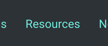
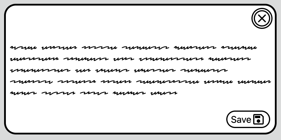
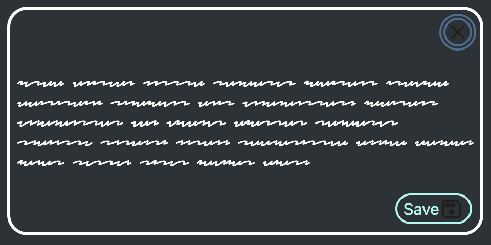
### Focus states
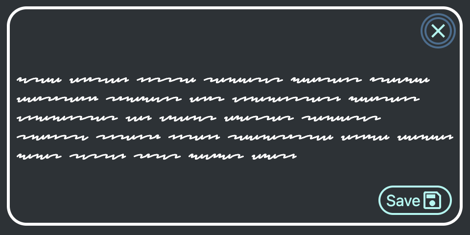
When a change in background or box-shadow is used as a focus indicator instead of the default focus outline, a Contrast Theme will render it invisible. Instead of removing the outline with `outline: none`, use `outline: 2px solid transparent`. A contrast theme will replace the `transparent` color with its text color for that element. Consider using a thicker outline and/or `outline-offset` to make the outline more apparent.

Default colors, box-shadow focus ring.
'Dusk' Contrast theme, no outline focus ring.
'Dusk' Contrast theme, with outline focus ring.
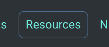
### Buttons and area shapes
Buttons and other elements sometimes use a background color or gradient alone to stand out on the page. As with focus states, consider adding a transparent border or outline, allowing the contrast theme to apply color to it: `border: 2px solid transparent`.
Default colors.
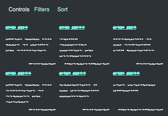
'Dusk' Contrast theme, no button borders or grid outlines.
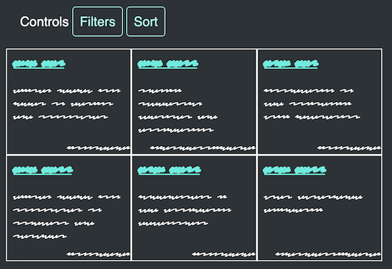
'Dusk' Contrast theme, with button borders and grid outlines.
### References to color
Where text refers to controls or content by color alone, change the text to refer to content by its name or text contents. "Click the red button" could be "Click the red 'Delete' button," "Read the instructions in the blue box" could have an "Instructions" heading in the blue box.
See also [Color for Meaning](/color-meaning "Color for Meaning").
### Images with transparency
Images with transparency often require a particular background (either light or dark) on its parent element. Otherwise, the contrast is too low and it's too hard to make out the details. The methods for keeping images legible when the background is changed depend on the type of image and how it is displayed.
#### Inline SVGs
Default colors.
'Dusk' Contrast theme, button icons barely visible on background color.
'Dusk' Contrast theme, button icons in theme's ButtonText color.
Inline, single-color SVGs are the most flexible because they can adopt the colors set by their surroundings. Apply `currentColor` to the `fill` (or `stroke`) to allow the image to inherit the current text color. This can be how its color is set all the time or wrapped in a media query to only apply when a Contrast Theme is enabled:
`@media (forced-colors: active) {`
` svg {`
` fill: currentColor;`
` }`
`}`
Alternatively, edit the SVG’s attributes directly:
``
#### Specific images
When you know whether a specific `` element needs a dark or light background, use the contrast theme's text color as the image's background color, based on the `prefers-color-scheme` set by the user.
For example, if an image is dark with a transparent background and the Contrast Theme forces a dark background, the image may disappear. To fix this, apply the Contrast Theme text color (`CanvasText`) as the image's background.
See the Pen forced-color specific images by Curtis Wilcox (@ccwilcox) on CodePen.
With this technique, the image's background color won't be what the user expects, but it will be a familiar color and it provides enough contrast for the image content. It requires either adding a class to the affected image or having a strict color system in which the `background-color` behind images is always known.
#### General images
When many different authors will be adding images relying on transparency and the `background-color` is uncertain, a different technique is required. For general `` elements, set the element's CSS property `forced-color-adjust: none` and set both its `background-color` and `color` match the colors used behind and around it (set both because `color` is used for the alt text if the image doesn't load). The result will be images having the same background color with an active Contrast Theme as they have by default; that color will be unfamiliar to the Contrast Theme user but the image will still be visible.
To work correctly, the colors must be set on the `` element, not inherited. Even using `background-color: inherit` is not effective.
See the Pen forced-color general images by Curtis Wilcox (@ccwilcox) on CodePen.
### Don't "fix" everything
The point of contrast themes is for users to take control of the colors on all sites and to have a more consistent experience. Don't try to recreate a site's design flourishes for the contrast theme user.
- Don't use the border alternative technique on *every* area with a background color, sometimes the spacing or area contents are enough to make associations and separations clear.
- Don't try to recreate `:hover` effects like reversing colors, let the `pointer`, name, and shape convey that an element can be clicked. Contrast themes limit presentation options and they may be needed for more important states, (focus, pressed, etc.).
- Use `forced-color-adjust: none` only on elements where it's essential the user sees colors the site has set.
- Consider hiding decorative images that may dominate the page, especially bright images for users using a dark contrast theme. This media query will match when that's the case: `@media (forced-colors: active) AND (prefers-color-scheme: dark)`.
## More information
- [Change color contrast in Windows - Microsoft](https://support.microsoft.com/en-us/windows/change-color-contrast-in-windows-fedc744c-90ac-69df-aed5-c8a90125e696)
- [Styling for Windows high contrast with new standards for forced colors - Microsoft Edge team](https://blogs.windows.com/msedgedev/2020/09/17/styling-for-windows-high-contrast-with-new-standards-for-forced-colors/)
- [Tests for forced colors, prefers-color-scheme, prefers-contrast](https://cdpn.io/pen/debug/LERxyXq)
- [System colors - MDN](https://developer.mozilla.org/en-US/docs/Web/CSS/Reference/Values/system-color)
- [What is Irlen Syndrome?](https://irlen.com/what-is-irlen-syndrome/)
## More blog posts
[### Someone Found an Accessibility Issue. Now What?
](/news/2026/06/someone-found-accessibility-issue-now-what) June 10, 2026
If you've ever filed a web accessibility concern or are thinking about it, you might wonder: does anyone actually read these? Who gets involved? What does a "fix" even look like, and how long does it take? Your report does not disappear into a black hole...
[### No, It's Not Just You: Why Reporting Accessibility Issues Matters
](/news/2026/05/reporting-accessibility-issues) May 29, 2026
If you spend enough time on university websites, apps, or online tools, you'll eventually run into something that just does not work as expected for accessibility. Whatever the barrier, we want to know about it. Here's how to tell us and why it matters.
[### In Digital Accessibility, We All Start Somewhere
](/news/2026/05/we-all-start-somewhere) May 14, 2026
A suggestion to help make accessibility something you can truly care about, and not just something you’ve been told you need to care about, is to discover your own, personal connection to it.

[ View All Posts arrow\_circle\_right ](/das-blog-all-posts)
See also:- [ Development ](/das-blog/development)