Support flexibility and adaptation

With modern, responsive design approaches that accommodate different screen sizes, including mobile, the concept of supporting display flexibility is much more widespread and the benefits more obvious. Flexibility is also important for accessibility reasons to support people who need to make changes to the way text is presented to make it more readable.

However, some designs are sufficiently rigid that changes applied through, for example, custom style sheets or text resizing through the browser have no effect; in other cases, changes may lead to text becoming unreadable or obscured by other content.

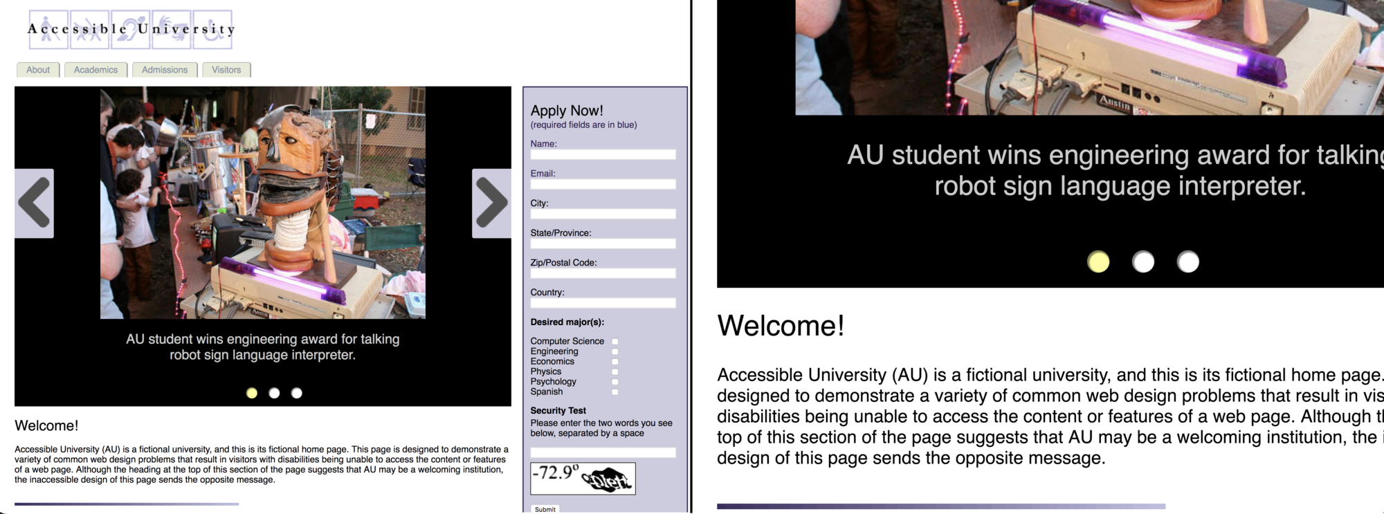
  • Avoid using images of text. Depending on the format and resolution of images, resizing an image of text may lead to loss of readability. Text in an image can’t be changed in appearance. In some cases, such as logos, images of text are unavoidable. But wherever possible, use text provided in HTML and styled in CSS over images of text.
  • Allow text to be resized without losing content or meaning and without unnecessarily requiring horizontal scrolling. Some people with reading difficulties will prefer to enlarge text only (as opposed to zooming the page layout).  People with cognitive or reading disabilities may read better when there is more space between letters, words, lines, or paragraphs. Use relative units when specifying text size and container size so that text can be enlarged using the browser’s native text-resizing functionality (for browsers where it’s available). Users need to be able to adjust these values by leveraging custom style sheets, extensions, bookmarklets, or browser settings. The page must also reflow properly when these settings do change so that all content is still visible. The recommendation in WCAG is to accommodate text resizing of 200% of browser’s default text size without any loss of text or overlapping with other content. WCAG also recommends that enlarged text word-wraps and reflows into a single, narrow column of text, so that there is no need for users to scroll horizontally back and forth across long lines of text.
  • Support user-defined style sheets. Make sure that CSS styling can be overridden, if necessary, by user stylesheets that control the appearance of content such as headings, paragraph text, hyperlinks, and lists. A prerequisite for this is to ensure that the pages’ content structure is represented accurately in the underlying HTML.
  • Allow content to display in orientation preferred by user. People who have their devices mounted in a specific orientation need applications to always work in that orientation. Users who can rotate their device may prefer one orientation to another and should have that choice. Build applications that respond to the orientation of the device. Only force a specific orientation when it is necessary for a particular feature; i.e., banking applications that need landscape orientation to take a clear picture of a check in its natural alignment.

Testing

  • Use native browser functionality (or a browser extension) to increase the browser’s text size to 150%. Is all text on the page still readable without the need for users to scroll horizontally?
  • Apply a user-defined style sheet that changes the appearance of heading, paragraph, and link text, including additional space between letters, words, lines or paragraphs. Are the changes in the user-defined style sheet applied as you had expected? Does the text still reflow as expected?
  • Check for images of text. Does the visual appearance of the text require them to be an image rather than HTML and CSS?
  • Check content display. Does the content respond to the orientation of the device?


Resources

✎ Technique: Orientation

Content does not restrict its view and operation to a single display orientation, such as portrait or landscape, unless a specific display orientation is essential (i.e., bank check). 

Responsive design illustration

(Source: Affinity Bridge on responsive design)

Examples

✗ Bad example: let the user determine how best to access content 

Non-responsive design forces users to make compromises, use extra time and exert additional effort to access information. And, in cases where users have mobility or other physical limitations, the information may be completely inaccessible. 

Screen capture of a non responsive HTML table

(Source: CSS-TRICKS article on responsive tables)

✓ Good example: adopt a responsive front-end framework

Screen capture of a responsive HTML table

(Source: CSS-TRICKS article on responsive tables)

Use "responsive design" principles (CSS @media queries) to detect if the screen is smaller than the maximum width of the table. If it is, the table gets reformatted, by

  1. Hiding the table headers (although still accessible by screen readers)
  2. Creating a new column with table headers placed in table rows.
  3. Displaying the content of each row within a single column

HTML table:


<table>
 <thead>
  <tr>
   <th>First Name</th>
   <th>Last Name</th>
   <th>Job Title</th>
  </tr>
 </thead>
 <tbody>
  <tr>
   <td>James</td>
   <td>Matman</td>
  <td>Chief Sandwich Eater</td>
  </tr>
  <tr>
   <td>The</td>
   <td>Tick</td>
   <td>Crimefighter Sorta</td>
  </tr>
 </tbody>
</table>

CSS:

/* 
Generic Styling, for Desktops/Laptops 
*/
table { 
  width: 100%; 
  border-collapse: collapse; 
}
/* Zebra striping */
tr:nth-of-type(odd) { 
  background: #eee; 
}
th { 
  background: #333; 
  color: white; 
  font-weight: bold; 
}
td, th { 
  padding: 6px; 
  border: 1px solid #ccc; 
  text-align: left; 
}

CSS for setting every table-related element to be block-level, then for each "cell", use CSS generated content (:before) to apply the column header to label the content originally shown in each row:

/* Max width will take effect for any screen smaller than 760px and also iPads specifically. */


@media
only screen and (max-width: 760px),
(min-device-width: 768px) and (max-device-width: 1024px) {

 /* Force table to not be like tables anymore */
  table, thead, tbody, th, td, tr {
    display: block;
    }

/* Hide table headers (but not display: none;, for accessibility) */
thead tr {
position: absolute;
top: -9999px;
left: -9999px;
}

tr { border: 1px solid #ccc; }

td {
/* Behave like a "row" */
border: none;
border-bottom: 1px solid #eee;
position: relative; padding-left: 50%;
}

td:before {
/* Now like a table header */
position: absolute;
/* Top/left values mimic padding */
top: 6px;
left: 6px;
width: 45%;
padding-right: 10px;
white-space: nowrap;
}

/* Label the data */
td:nth-of-type(1):before { content: "First Name"; }
td:nth-of-type(2):before { content: "Last Name"; }
td:nth-of-type(3):before { content: "Job Title"; }
td:nth-of-type(4):before { content: "Favorite Color"; }
td:nth-of-type(5):before { content: "Wars of Trek?"; }
td:nth-of-type(6):before { content: "Secret Alias"; }
td:nth-of-type(7):before { content: "Date of Birth"; }
td:nth-of-type(8):before { content: "Dream Vacation City"; }
td:nth-of-type(9):before { content: "GPA"; }
td:nth-of-type(10):before { content: "Arbitrary Data"; }
}

✎ Technique: Reflow

Use responsive design to allow your content to zoom and respond to various screen sizes.

Present content without loss of information or functionality, and without requiring scrolling in two dimensions, except for parts of the content which require two-dimensional layout for usage or meaning.

Examples of content which require two-dimensional layout are images, maps, diagrams, video, games, presentations, data tables, and interfaces where it is necessary to keep toolbars in view while manipulating content.

(Source: Knowbility article on Reflow)  

Examples

✗ Bad example: increasing the size of the view requires horizontal scroll

When zoomed, the page requires both vertical and horizontal scrolling to access information. 

Screen capture of non responsive content

(Source: Accessible University by University of Washington)

✓ Good example: increasing the size of the view doesn't require horizontal scroll

This web site is zoomed from 100% to 400%. When zoomed, the page has a vertical arrangement for scrolling in one direction, up and down, to access information. 

The navigation menu across the top collapses into a menu button in the upper right as the screen size diminishes.

Screen capture of responsive content

(Source: Knowbility article on Reflow)

✎ Technique: Text spacing

Anyone who needs to change the font or text display properties to read the content will benefit from this guideline. This includes people with low vision who use a bigger font, and people with dyslexia, reading, or other cognitive disabilities, who may have specific spacing requirements.


Examples

✗ Bad example: Non responsive interface.

The effect of changing the text spacing and line height on a non-responsive interface: some of the headline text of each item no longer displays

Non responsive interface, default font setting.  Non responsive interface, increased font spacing.

✓ Good example: Responsive interface.

The effect of changing the text spacing and line height on a responsive interface: the headline text of each item always displays

Non responsive interface, default font setting.  Non responsive interface, changed font setting.

(Source: Knowbility article on text spacing)


✎ Technique: Readable paragraph text

Paragraphs of text are a fundamental core of web content, so it's important to display them in a fashion that is optimally readable to the majority of your audience without requiring them to change their display settings. For people who do need to customize display of text to make it easier to read, it's important to support this customization rather than forcing them to read the text the way you specify.

For the most part, this means applying typesetting best practices, which predate the web.

Examples

Bad example


p.bad {
  font-family: serif;
  line-height: 1;
  text-align: justify;
}

There are a number of things wrong with this example:

  • The line-height or "leading" is too tight at just 1. There needs to be some space (although not too much!) between each run of text, to separate them. A value of 1.3 to 1.5 is optimal, depending on the font.
  • Justified text can produce readability issues for people with dyslexia and other conditions that affect reading and comprehension.
  • Justified text can produce unevenly enlarged spaces between certain words, sometimes known as "rivers".
  • The width of a paragraph is called the "measure." Measures that are too wide make it difficult for readers to scan back to find the start of the following line. In this case, it is not set at all, meaning it can easily grow too large on wider viewports.
  • The typeface is a serif font. While accessibility requirements do not mandate use of specific fonts, be aware that people who have online reading difficulties benefit from body text set using a clear, consistently formed and balanced sans-serif font.
Careful styling can help overcome these issues in HTML documents and in online documents that are published in other formats, such as Word or PDF, while also providing flexibility for people who need to customize text appearance.
 

Code editor

In the code editor, you'll find the bad example described above and an alternative. Try different fonts to see where the line-height and other metrics need to be adjusted.

See the Pen good and bad examples of readable text by HUIT - Web, UX and Digital Accessibility Services (@hwpdas) on CodePen.

✎ Technique: Text and images of text

Some people with reading difficulties or visual impairments need to customize the display of text to make it easier to read. When text is presented as an image of text, that limits their ability to change the appearance of that text. So wherever possible, use text along with CSS to apply styling (such as color, typeface, or size).

If you use an online content editor to write content, the styling will happen automatically. If you feel that you need text that deviates from the style, formatting options provided by online content editors should allow you to update the style for that text.

Only in extreme circumstances, such as when a logo is used, should you provide an image of text rather than text. If you do this, you'll need to provide that same text as the image’s text alternative so that screen-reader users can access the text.

Examples

Bad example

In a WYSIWYG editor, it is possible to upload an image of some text (let's say, "delicious pancakes") and insert it into the page with alternative text that matches the text exactly:


<img src="/path/to/text.png" alt="delicious pancakes" />

One disadvantage here is that screen readers will, in some contexts, read the alternative text with "graphic" appended, and you might not want the user to know that the text is really an image. In addition, text that’s inside an image isn’t translatable into different languages, selectable for copy/paste, or resizable without degrading its quality.

Use CSS and web fonts


Write the text as text in the editor and let the publishing system apply styling.

Behind the scenes, the text will be styled using web fonts and CSS properties such as background, text-shadow and color.


.pancakes-text {
  font-family: PancakeFont, FallbackFont, sans-serif;
  color: SandyBrown;
  text-shadow: 0.02em 0.02em 0 Brown, 
                        0 0 0.5em violet;
}

Code editor

You can experiment with CSS text styling in this code editor, using the above rules as a starting point.

See the Pen CSS text styling by HUIT - Web, UX and Digital Accessibility Services (@hwpdas) on CodePen.

✎ Technique: Enable text resizing

Some people with reduced visual acuity may not need screen magnification software or screen readers but might still have problems reading smaller fonts. So the ability to allow easy enlargement of text size is important.

There are a number of ways to zoom web-page content in to enlarge text without needing to provide explicit controls to do so. To avoid diminishing this variety of user control, you have to be careful how you code font sizes.

Examples

Many users will zoom their web pages using CTRL and "+" or CMD and "+". This will enlarge the pages proportionately, so there's little you need to do in terms of intervention. However, you should also take into account that some users may choose to resize just their text. Setting a px based font-size on the html element suppresses this ability, but a percentage based value does not. In this example, 100% means “100% of the size the user chose in their browser or OS settings:”


html {
  font-size: 100%;
}

When the user changes their font size—say, by choosing "Large" in Chrome's advanced settings—the font-size will increase as expected—that is, if no px sizes are used further down in the page’s CSS. So all font sizes after that, the html element should be set using the relative units like em or rem. To make sure line-height adjusts proportionately, define your CSS line-height using relative units or unit-less values. If you don’t, when the font size increases, the line height will remain the same, resulting in poor line height and reduced readability.

Bad example


html {
  font-size: 100%;
}

p {
  font-size: 1em;
  line-height: 20px;
}

In the above code, the line-height uses an absolute value (it’s not relative to the root font size). The result, after the user enlarges their text in their settings, will be something similar to this:

Paragraph text with squished line height

Good example


html {
  font-size: 100%;
}

p {
  font-size: 1em;
  line-height: 1.5;
}

In this example, the line-height is always equal to 1.5 times the current font-size. So whether the text size may be increased or decreased, the line height will remain appropriate at any text size.

Note: To make sure text resizing is possible via pinch zoom on touch devices, you need to use the correct viewport meta tag:


<!-- don't use this -->
<meta name="viewport" content="width=device-width, initial-scale=1.0, minimum-scale=1.0, maximum-scale=1.0, user-scalable=no">

<!-- use this -->
<meta name="viewport" content="width=device-width, initial-scale=1.0">