Use responsive design to allow your content to zoom and respond to various screen sizes.
Present content without loss of information or functionality, and without requiring scrolling in two dimensions, except for parts of the content which require two-dimensional layout for usage or meaning.
Examples of content which require two-dimensional layout are images, maps, diagrams, video, games, presentations, data tables, and interfaces where it is necessary to keep toolbars in view while manipulating content.
(Source: Knowbility article on Reflow)
Examples
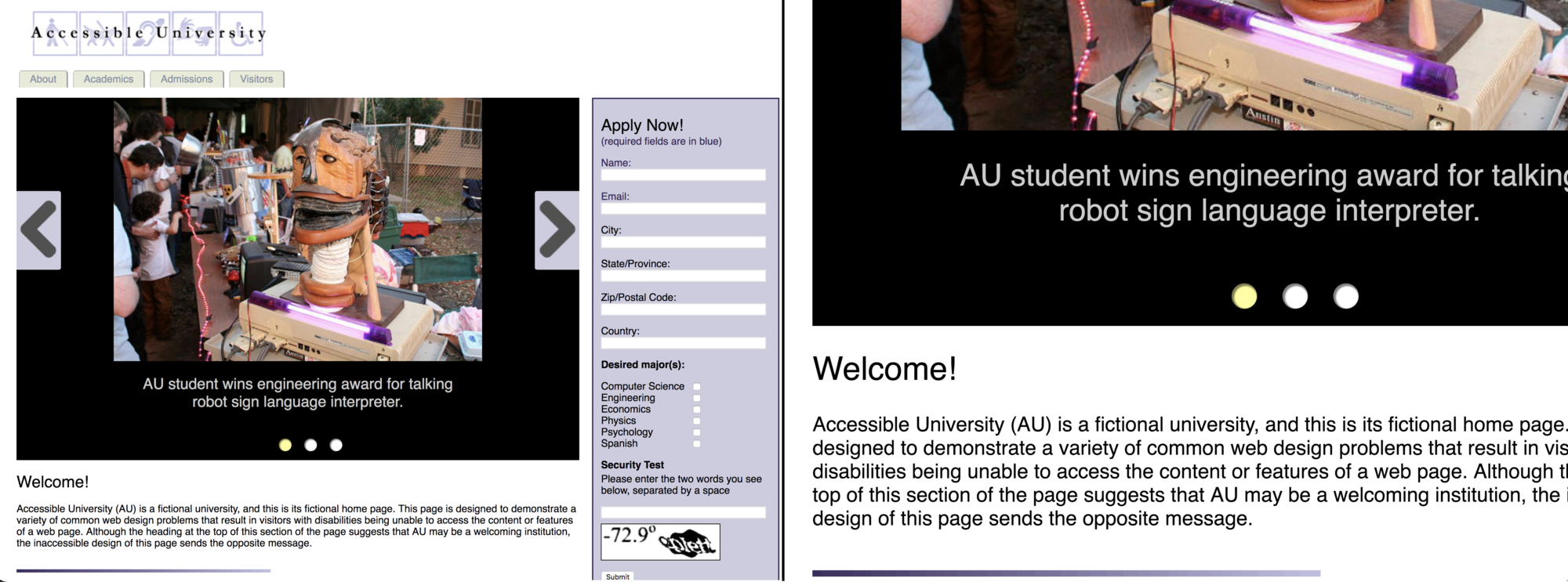
✗ Bad example: increasing the size of the view requires horizontal scroll
When zoomed, the page requires both vertical and horizontal scrolling to access information.

(Source: Accessible University by University of Washington)
✓ Good example: increasing the size of the view doesn't require horizontal scroll
This web site is zoomed from 100% to 400%. When zoomed, the page has a vertical arrangement for scrolling in one direction, up and down, to access information.
The navigation menu across the top collapses into a menu button in the upper right as the screen size diminishes.

(Source: Knowbility article on Reflow)