Data Visualizations, Charts, and Graphs
Data visualizations such as charts, diagrams, and infographics are popular as they can present data in a concise and compact way.
But visualizations are often not accessible due to low contrast colors, insufficient labels, or images without alternative text.
This means that part of your audience might be excluded from the information being presented. With some thoughtful planning, we can create charts and graphs that are accessible to everyone.
In this page:
- Design and Color Choices
- Labels and Descriptions
- Supplemental Formats
- Interactive Data Visualizations
- Building your Data Visualization
Design

When you’re deciding what kind of chart or graph you want to create, it might be tempting to try something different or unique. But when it comes to presenting data, visualizations are most powerful and accessible when the design is familiar rather than a complex novelty.
The important thing is to not overwhelm people with information. If you try to show too much, people might lose the most important pieces. Instead, carefully select only the data that will support your clarity of intent, so that your main message isn’t lost.
Keep your designs simple and clear, and avoid animations as they can be distracting and disorienting. If you must include some type of movement in the visualization, provide a way for people to turn it off.
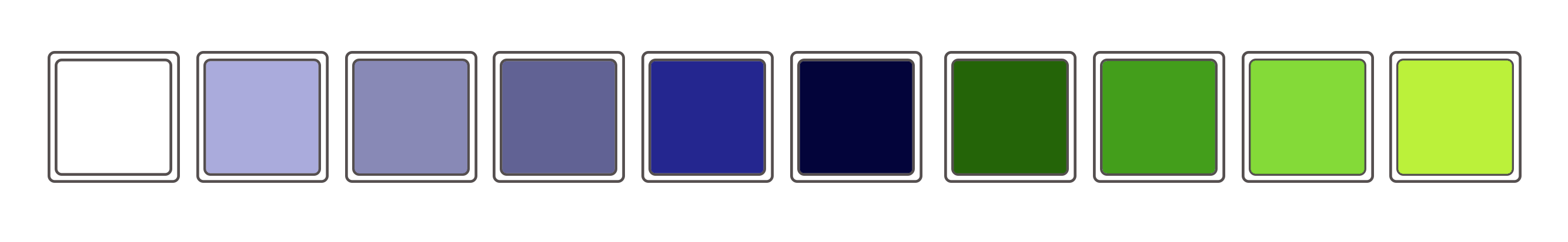
Color Choices
Color can be a powerful visual tool in visualizations. When designing a chart or graph, be mindful of the colors you use, the contrast of the text against the background, and how you’re using color to convey meaning. For adjacent data parts, like bars or pie wedges, use a solid border color to separate and add an additional layer of visual distinction between the pieces.
Text Contrast
The color of any text should have a contrast ratio of at least 4.5:1 against the background color.
You can measure the color contrast with a tool such as the WebAIM Contrast Checker.
Object Contrast
For bars in a bar graph or sections of a pie chart, aim to provide a high degree of contrast against the background and against each element. The contrast ratio for these should be 3:1. For example, if you’re using red and blue to show two bars in a bar graph, the red and blue should have a contrast of at least 3:1.
Conveying Meaning
If color is the only way that you’re conveying meaning, your information might be lost to someone who can’t see color. Instead of relying on color alone to explain the data, add an additional visual indicator, such as a pattern, shape, or text label so that even if someone is unable to perceive color, they’ll still be able to understand the data. But be careful not to overdo patterns - keep them simple and clear.

Example - Shape Differences
The colored lines also have shape differences (diamond, square, triangle) to identify them.
Credit: University of Arkansas Division of Agriculture

Example - Pattern Differences
The columns have different patterns to help distinguish beyond just color.
Image Credit: Zach Grosser - Accessible Colors for Data Visualization
Labels and Descriptions
Whether a data visualization is simple or complex, there should be clear text that labels the significant parts of the data. Ensure major elements are identified, such as the chart title, the horizontal and vertical axis and other notable framework elements. Use labels and legends that clearly mark and distinguish the data points.
Also add either brief alternative “alt” text or a longer description that provides context and explains the most important details about the visualization.

Example - Direct Labeling
If possible, use "direct labeling" - position the label directly beside or adjacent to the data point. Here with have line graph with the text for each line directly adjacent.
Image Credit: storytelling with data.

Example - Data Point Callouts
Each data point has the callout for the amount so a user doesn't have to guess or rely on color to identify different slices.
Supplemental Formats
Another way to make sure your data and message can be understood by your audience is to provide a supplemental format for the data.
People learn in different ways - some might be visual learners while others prefer a more analytical text-based approach. Presenting data in multiple formats will ensure that people can digest the information in the way that best suits their needs.
Example - Include a table or spreadsheet
Here we provide both the bar chart and a link to the data in table form.

Example - Chart Description
Consider providing a link to a longer description or include it adjacent to the chart in a collapsible section.
Interactive Data Visualizations
For data visualizations that are interactive, provide a brief text alternative along with a supplemental format. This provides a baseline to ensure all users can understand the key points at a glance while also having access to the full raw data.
To enhance accessibility, a visualization can be treated similar to a web app, applying all the same principles you would to any other web content:
No interaction relies on mouse hover.
- Each data point is accessible by keyboard. Focus and other interactive states have appropriate visual indicators.
- The layout of the design can accommodate zoom and font increase by the user without breaking the content or losing meaning.
Learn more at our Clear and Concise UI guide for designers.
Using Third-Party Data Visualization Tools
When using a third-party platform to build visualizations, useful accessibility features may include:
- Keyboard-navigable data points.
- Alternative format or data download, such as csv or HTML table.
- Text alternative.
- Screen reader support, such as announcing changes in view when applying filters.
- SVG export for tactile printing.
- Accessible color and pattern options.
Note that the terminology used for any of the above features may vary depending on the platform. Additionally, consider whether the tool includes a publishing platform or whether a developer is required to build the visualizations.
Building your Data Visualization
Before you get started, it’s worth pausing and thinking about the data you want to present and what platform, program, or tool you'll use to build your visualization. We'll share three options below for how you might build and display your data visualization.

Option 1 - Image with Alt Text
No matter where you create your data visualizations, you will likely have an option to export as an image (such as .jpg or .svg) or to take a screenshot. These image files may then be used anywhere that you’d like to share the data. When sharing as an image, be sure to include alternative text that succinctly describes the visualization.
When writing alt text consider the type of the chart and the intent of its use in your content. Try to summarize key points. For example:
- A bar graph of fundraising by mayoral candidate. Candidate Smith has raised twice as much as Candidate Jones.
- A pie chart of television programming where sports is 32%, news 48%, and sitcoms are 30%.
Advantages
The color and design of the visualization is stable and will not change if imported from one program to another.
Disadvantages
Best for simple visualizations with limited content. Images may become pixelated. Content owner will have to keep track of the source file for future edits and changes.

Option 2 - Created within a Document
Microsoft, Google, and other common document creation programs offer tools for creating visualizations as part of your standard document editing. Learn more at Microsoft Chart Guidance or Google Chart Guidance.
Advantages
These programs have a low learning curve for users new to designing visualization. You can easily make accessible diagrams and charts.
Disadvantages
If sharing in a different program or slide theme, the colors or text may change, introducing accessibility errors. In some cases your chart may be converted into an image that would then require alt text.

Option 3 - Created using a Chart Library or Custom Build
You may choose to design your own visualizations or use a chart library to design and embed visualizations. Whichever you choose, there are a few additional considerations to keep in mind, such as keyboard access, screen reader access, focus indicator, and names and roles. However, some well-designed chart libraries (such as Highcharts) take care of many of these considerations for you.
Advantages
Allows the greatest flexibility in design. Versatility in embedding the data visualization in a variety of places for display.
Disadvantages
Steeper learning curve. Some tools are not accessible, so use the criteria above to evaluate before building a chart or graph. You might also have to pay for a license to use the tool.
Additional Resources
- Technique: Describing graphs
- 10 Guidelines for DataViz Accessibility – Highcharts
- An intro to designing accessible data visualizations by Sarah L. Fossheim
- 5 easy ways to make your data visualization more accessible
- Accessibility Considerations in Data Visualization Design
- How to make charts and graphs more accessible – Pope Tech