✎ Technique: Describing graphs
Some people understand complex information best when it's presented visually, such as as a chart or diagram, while others find that reading the information suits them better. For people who use screen readers, a good text equivalent of the information that’s presented graphically is essential for their understanding.
For simple graphics, providing a succinct, informative text alternative is usually fine. But for complex graphics, it's not enough to provide a screen reader user with only short alternative text, such as "population graph." You also need to think about the information that the graphic conveys, such as the categories of data being shown, trends, and maximum and minimum values.
Example
In this example, we're going to provide a text alternative for a graph, using HTML to give an alt attribute to the graph and some visible text to provide additional information.
The alternative text for the graph (supplied through its alt attribute, which you can add when you upload a graphic using a web editor) would be too long if it were to describe everything in the graph, so it just describes the graph's purpose. And by placing this paragraph first, we make sure screen reader users can still get the information they need.
Media Sources for the Iraq War
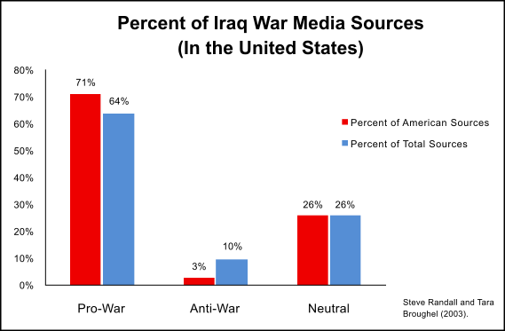
Analysis of media coverage during the Iraq war was by no means universally objective. In fact, it's clear that coverage was overall pro-war with American news sources being slightly more pro-war than sources from outside the US. Neutral coverage came in at 26%, while a minority of sources were determined to be anti-war. Only 3% of American sources fell into that category.