Provide name, role, and value information

Users of assistive technologies must understand what a custom control is and what it does. Custom controls that lack accessibility information become difficult or impossible to understand or operate. Using WAI-ARIA provides a way to fill in missing accessibility information so that assistive technologies can recognize custom controls as controls and not as div or span elements without semantic meaning or value.

  • Provide an accessible name for each custom component. An accessible name is effectively the label for a control, explaining what it does. For custom components, the corresponding design pattern defines the best way to provide the accessible name.
  • Provide controls for which the visible text label matches the accessible name. [NoteThe programmatic label of a control is its accessible name.] When the accessible name is different from the visible label, it essentially becomes an unknown hidden command for speech input users that can be accidentally activated without the user knowing what has happened. 
  • Provide an accessible role for each custom component. WAI-ARIA defines a large number of values for the role attribute, which are used by assistive technologies to convey the component’s purpose. Give each custom control a suitable role attribute, such as role="button" for custom buttons or role="slider" for slider widgets.
  • Provide and maintain an accurate states and values for each custom component. This means giving custom form components, such as sliders, suitable values that represent their current value plus any additional required values, such as maximum and minimum possible. For controls that change visual appearance, such as a menu item with an associated dropdown menu or a button that is a show/hide toggle button for additional content, their current state must reflect whether their associated content is shown.

These are links to design patterns for selected controls and UI widgets:

Testing

Use a code inspector (see the Tools page for examples) to query each interactive control for its name, role, and current state or value information.

  • Is this information provided?
  • If so, is it accurate?
  • Does the visible name match the accessible name?
  • When you interact with the control, is its current state and value updated?

Validate your answers by using a screen reader to interact with the widget. Is this accessibility information exposed meaningfully and understandably?

More information

See also: Forms

✎ Technique: Label in name

People with disabilities rely on interface controls that are used programmatically. These controls have a visual label, as well as a programmatic label, known as its Accessible Name. Users have a much better experience if the visible text labels of controls match their accessible names.

Speech input users can navigate by speaking the visible text labels of menus, links and buttons that appear on the screen. It’s confusing to speech input users when they say a visible text label they see, but the speech input does not work because the accessible name that is enabled as a speech input command does not match the visible label.

Examples

✗ Bad example:

An icon has no accompanying text, assuming that the function it depicts matches the function that it triggers

Screen capture of a search form without matching labels nor tooltip


✓ Good example:

If an icon has no accompanying text, consider using its hover text (tooltip via title or alt tags) as its accessible name

Screen capture of a search form with matching labels and matching tooltip Screen capture of a search form with matching labels and matching tooltip

✗ Bad example: 

Accessible name contains the visible label text, but the words of the visible label are not in the same order as they are in the tooltip

Screen capture of a form with un-matched label and tooltip information

✓ Good example:

Accessible name contains the visible label text, which matches the order of the words in the tooltip

 Screen capture of a search form with matching labels and matching tooltip

✗ Bad example: 

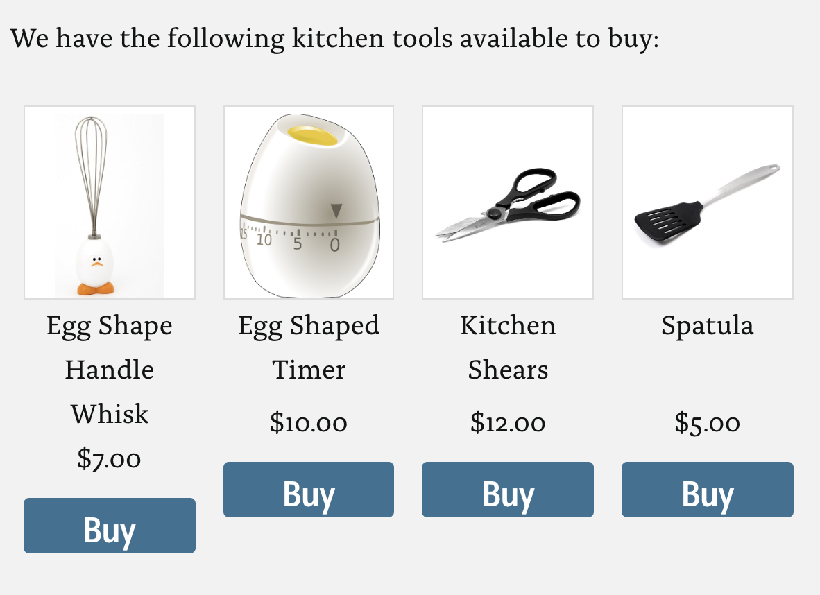
The button below each product has the label “Buy.” A screen reader would say “buy,” but this doesn't provide sufficient information to the user to understand which which item to buy.  

Example of inaccessible labels

✓ Good example:

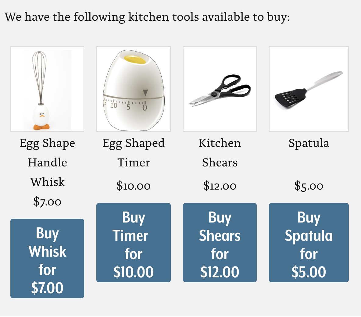
To solve this issue, make the label and the accessible name the same. The aria-label (which is the accessible name) of  button should include information such as: “Buy <item name> for <amount>.”

In this example, the accessible name that a screen reader user hears is “Buy <item name> for <amount>.” Any other user also benefits by seeing “Buy <item name> for <amount>”.

Example of accessible labels

(Source: Knowbility article on label in name)

✎ Technique: Autocomplete input controls

Autocomplete widgets can be helpful for accessibility because they can make it easier to enter text by providing suggestions based on the characters initially typed. This particularly helps people who find typing more difficult and people who may be susceptible to spelling mistakes.

Creating an accessible integrated autocomplete widget is a complex process. You need to ensure that screen-reader users are notified when the list of suggestions appears and that they can enter the list and select an option using the keyboard.

One solution is to use an ARIA live region to announce when autocomplete options are available, and to create a listbox containing the options that appear as the user types, which is controlled with the up and down arrow keys.

Example

For this example, we’re manually implementing autocomplete for a “choose your pet” input. To begin with, the markup should look like this:


<form>
  <label for="pets">Choose a pet</label>
  <div class="suggestions-container">
    <div class="suggestions-help" role="status" aria-live="polite"></div>
    <input id="pets" data-suggest type="text" autocomplete="off" aria-autocomplete="list">
    <div class="suggestions"></div>
  </div>
</form>

Note the .suggestions-help live region and .suggestions, which will need to be populated with the listbox (where applicable) on the input event. Also note autocomplete="off", which suppresses native autocomplete functionality that could get in the way of our custom UI. The ARIA property of aria-autocomplete="list" replaces the semantics so that “autocomplete” is announced on focus.

$('[data-suggest]').on('input', function() {
  // handle suggestions here
});

In the code editor example you’ll see an array of pet types. As the user types, the input event listens for changes and compares the entered value to each item in the pets array. If there are matches, the first thing the script does is alert the user using the live region:


if (!_.isEmpty(suggestions)) {
      $('.suggestions-help', scope).text(
      'There are '+suggestions.length+' suggestions. Use the up and down arrows to browse.');
    }
  }

This tells the user how many suggestions are available (suggestions.length) and—importantly—how to choose from those suggestions. The newly populated listbox is made focusable using tabindex="0", and it is focused if the user presses the down arrow key. In this state, list’s markup looks like this:


<div role="listbox" tabindex="0" aria-activedescendant="pets-0">
  <div id="pets-0" role="option" tabindex="-1">hamster</div>
  <div id="pets-1" role="option" tabindex="-1">hermit crab</div>
  <div id="pets-2" role="option" tabindex="-1">horse</div>
</div>

Note the listbox role and that each child of the listbox has a role of option. This is the only way that a listbox will provide the correct information to screen readers.

Also note that the listbox has a property called aria-activedescendant. This keeps track of the “active” option as the user searches through the options with the up and down keys. It uses the current option’s id as its value, and that value is updated with JavaScript. That way, whenever a new option is made active, screen readers should announce the option’s text, such as “cat,” and the index of the option, such as “two of three.”

To choose the selected list option, the user can hit enter, which clears the list of options from the listbox and refocuses the input field:


if (e.keyCode == 13) {
  e.preventDefault();
  e.stopPropagation();
  $('#pets').focus();
}

Code editor

See this custom autocomplete implementation in a code editor. Try operating it with just your keyboard, with a screen reader running at the same time.

See the Pen autocomplete input controls by HUIT - Web, UX and Digital Accessibility Services (@hwpdas) on CodePen.

✎ Technique: Required fields

A clear indication that specific form fields are required can save users time and avoid potential errors relating to missing data when a form is submitted.

This indication should be visually distinct without relying on color, and it should also be programmatically available to screen-reader users.

Examples

Bad example

In this example, the asterisk is placed next to the text input. It has no connection to the input, so it will not be read aloud when the input is focused, and the screen-reader user would have no idea that it was required. If it were read, it would be read as “asterisk,” even though it should be read as “required.”


<label for="email">Your email</label>
<input type="text" id="email" /> <span>*</span>

Bad example

In this example, the asterisk is inside the label, so it is announced. However, “asterisk” or “star” does not clearly convey that the field is required.


<label for="email">Your email *</label>
<input type="text" id="email" />

Good example

In this example, the aria-required attribute is placed on the form field itself, meaning that “required” will be read when the control has focus. In addition, the redundant “star” is hidden from screen readers by placing it inside a <span> with aria-hidden="true". Content in a DOM tree with an aria-hidden="true" attribute is ignored by screen readers.


<label for="email">Your email <span aria-hidden="true">*</span></label>
<input type="text" id="email" aria-required="true" />

This information is now available to screen readers whenever the field is focused. For example, VoiceOver (macOS) will read, “Your email, required, edit text.”

✎ Technique: Accessible modal dialogs

Modal dialogs can enhance usability by focusing attention on a specific message that requires a user action to continue.

An accessible modal dialog is one where keyboard focus is managed properly, and the correct information is exposed to screen readers. HTML and WAI-ARIA can be used to provide the necessary semantic information, CSS the appearance and Javascript the behavior.

Example

In this modal dialog example, we’ll look at the HTML, CSS and JavaScript separately.

HTML

The dialog itself must be constructed from a combination of HTML and WAI-ARIA attributes, as in this example:


<div id="dialog" role="dialog" aria-labelledby="title" aria-describedby="description">
  <h1 id="title">Title of the dialog</h1>
  <p id="description">Information provided by the dialog.</p>
  <button id="close" aria-label="close">×</button>
</div>

Note the dialog role, which tells assistive technologies that the element is a dialog. The aria-labelledby and aria-describedby attributes are “relationship” attributes that connect the dialog to its title and description explicitly. So when focus is moved to the dialog or inside it, the text within those two elements will be read in succession. The close button has an aria-label attribute that overrides the element’s text character of “times” to read “close” when screen readers interact with it.

CSS

As well as some CSS for color and positioning, the dialog is set to display:none by default. When the custom attribute open is added to the dialog with JavaScript, the dialog is revealed.


[role="dialog"][data-open] {
  display: block;
}

Distinctive focus styles are added for the dialog’s the opening and closing buttons so that it’s clear to keyboard users which element is focused. This style is paired with the hover style so that keyboard and mouse operation look consistent.


button:focus, button:hover  {
  outline: 3px solid #d4aa00;
}

JavaScript

When the “trigger” button is pressed, the script runs the openDialog() function:


function openDialog() {
  dialog.setAttribute('data-open', '');
  close.focus();
  close.addEventListener('keydown', function(e) {
    if (e.keyCode == 9) {
      e.preventDefault();
    }
  });
  document.getElementById('cover').style.display = 'block';
  document.addEventListener('keydown', addESC);
}

First, dialog.setAttribute('data-open', '') adds the open attribute to the dialog, which sets the dialog’s CSS display value to block. Next, focus is moved to the dialog’s close button. This does two things: It triggers the announcement of the dialog's title and description in screen readers, and it makes the dialog easy to close at the press of a key.

The next block confines focus to the close button, making sure the user does not accidentally leave the dialog until it has been dismissed. That is, if the TAB key is pressed—which would move focus away from the dialog—the default behavior is suppressed with e.preventDefault();.

Note the line with "addESC" at the end. That adds a listener for the ESC key so that when it is pressed, closeDialog() is run. It is conventional to be able to close a dialog with the ESC key.


var addESC = function(e) {
  if (e.keyCode == 27) {
    closeDialog();
  } 
}

Clicking or pressing ENTER on the close button will also fire closeDialog():


function closeDialog() {
  dialog.removeAttribute('data-open');
  trigger.focus();      
  document.getElementById('cover').style.display = 'none';
  document.removeEventListener('keydown', addESC);
}

Note the trigger.focus() line that moves focus back to whichever element opened the dialog. This is important: Keyboard users should always be returned to where they were before they opened the dialog. If you don't do that, when the close button is hidden (and no longer focusable) the <body> element will be focused by default. That will force keyboard users to step through the page manually to find the spot where they left off.

Code editor

Try operating the dialog with only your keyboard in the code editor provided (external link). See how the keyboard operation is affected when you remove the JavaScript lines that manage focus!

See the Pen accessible modal dialog by HUIT - Web, UX and Digital Accessibility Services (@hwpdas) on CodePen.

✎ Technique: Expandable sections

Expandables (sometimes called “collapsible” or “disclosure widgets”) are simple interface patterns that allow you to expand and collapse content. They can be helpful accessibility aids as they give users the choice of revealing content to read it, or bypassing the content, making page navigation more efficient for screen-reader users and people using the keyboard or alternative input devices.

To ensure that they are accessible, it's important that expandable sections are coded so that their state (expanded or collapsed) and the relationship between the toggle button and the expandable content are established programmatically.

It's also important to ensure that the toggle functionality can be operated using the keyboard. This means including the toggle button in the focus order and supporting standard keyboard shortcuts (spacebar and Enter) to activate the button.

Example

This code example shows the collapsed state. Note the aria-controls relationship attribute that establishes the relationship between the toggle button and the content (through the content’s id). Also note that the aria-expanded state attribute is set to false and, correspondingly, aria-hidden is set to true.


<h3>
  <button data-action="disclosure" aria-controls="section-name" aria-expanded="false">Title of section</button> </h3> <p id="section-name" aria-hidden="true">Section content tincidunt turpis nec ultrices tristique. Aliquam bibendum metus dignissim dui placerat, sed porta urna blandit. Ut condimentum magna sit amet nulla finibus vestibulum.</p> 

This code example shows the expandable section in its expanded state. Note the change in the aria-expanded and aria-hidden values.

    
<h3>
  <button data-action="disclosure" aria-controls="section-name" aria-expanded="true">Title of section</button>
</h3>
<p id="section-name" aria-hidden="false">Section content tincidunt turpis nec ultrices tristique. Aliquam bibendum metus dignissim dui placerat, sed porta urna blandit. Ut condimentum magna sit amet nulla finibus vestibulum.</p>


✗ Bad example

In this example, the <h3> has been used as the toggle element. The <h3> element is not a natively interactive element, and so there's no way to focus it with a keyboard.

<h3 aria-controls="section-name" aria-expanded="true">Title of section</h3>
<p id="section-name" aria-hidden="false">Section content tincidunt turpis nec ultrices tristique. Aliquam bibendum metus dignissim dui placerat, sed porta urna blandit. Ut condimentum magna sit amet nulla finibus vestibulum.</p> 

Code editor

Code editor for the expandable pattern as a jQuery plugin (external link)

See the Pen expandable section with jQuery plugin by HUIT - Web, UX and Digital Accessibility Services (@hwpdas) on CodePen.

✎ Technique: Accessible names for buttons

Accessible names are the labels given to HTML elements that can be announced in assistive technologies such as screen readers. They may or may not be visible to sighted interface users, depending on context.

Whether you provide controls using standard HTML elements or create custom controls, ensure that controls are given appropriate names. There are a number of ways to provide accessible names.

Examples

Text node

The most common way to provide an accessible name is through an element's text node. In the following example of a Close button, the button element contains the text "close". When a user focuses the button with a screen reader running, the screen reader would announce "close" (the accessible name), then "button" (the element's role).


<button>close</button>

aria-label

Perhaps you'd prefer your close button to be represented by a simple "×" symbol. One way to do this would be to use the the "×" character. Unfortunately, screen readers identify this as the multiplication "times" symbol and would announce "times button," which is unclear. To override this poor accessible name, you can apply an aria-label attribute with the value "close".


<button aria-label="close">&times;</button>

The alt attribute

If you are looking for more control over how the "×" symbol looks, you may wish to draw it and include it as an image. The accessible name for an image is typically provided by its alt attribute. When you place an <img/> within a <button>, the button takes its accessible name from the image.


<button><img src="path/to/button.svg" alt="close" /></button>

Video: Accessible names for Buttons with Chrome and VoiceOver