Make it easier for users to interact with added content. Tooltips, drop-down menus, and popups are examples of added content. This new content is usually made visible when you put your mouse pointer over a "trigger" item such as a button or link. It can also display when an item receives focus. Some people have difficulty keeping the mouse pointer over the trigger item. Also, the new content will sometimes obscure existing content. The three requirements of this success criterion, as outlined below, help make the added content more operable.
Dismissable
When using magnification, tooltips or added content can display on top of other information. Unless the newly visible content is displaying an error, the user must be able to dismiss that content without moving the mouse or changing focus. The easiest way to implement this is by providing a keyboard command, such as pressing the escape key, to close the content. The developer can also include a close button within the added content.
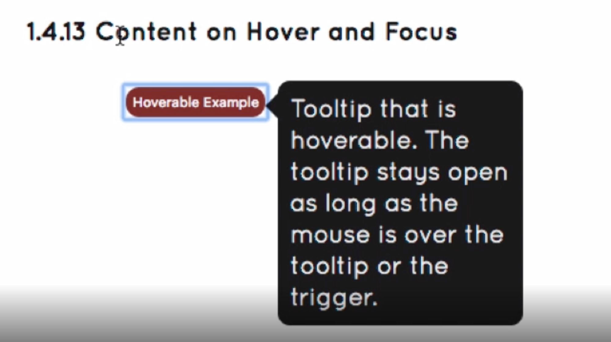
Hoverable
Often the new content only displays when the mouse pointer is over the trigger element and disappears when the mouse moves off of the trigger. It can be hard for people with tremors or limited movement to keep the mouse over the trigger element. To remedy that situation, the content must stay visible as long as the mouse remains over the trigger or the mouse moves onto and remains over the new content.
Persistent
This rule combines the previous two. The content must remain visible until the user dismisses it, the hover or focus trigger is removed, or the information is no longer valid.
Examples
✗ Bad example: new content is visible only for the time defined by the program.
|
New content is visible when tab key selects the link or when mouse hovers the link 
|
New content disappears after the time defined by the program 
|
✓ Good example: new content is visible as long as the user decides to move away.
|
New content is visible when tab key selects the link 
|
New content is visible when mouse hovers the link 
|
New content is invisible when tab key or mouse move away 
|