Color for Meaning
Color is a great communication tool. When using color to indicate meaning, it is important to be mindful that your intended meaning is not lost for users who either can’t see the specific colors or who may use assistive technology to read your page aloud.
Adding a secondary cue will ensure that meaning can be understood beyond color alone. Secondary cues could be:
- Text differences
- Shape differences
- Labels
By making the information available in multiple ways, you ensure that all your users have access to the same information.
Example 1 - Use Text
In this example, a user has provided their feedback to an email as "see my notes in red." We expand on this, adding a secondary cue (text) that says "see my notes in red and marked with my name."
Original:
Uses color alone to indicate meaning.
Accessible:
Uses color and text to indicate meaning.
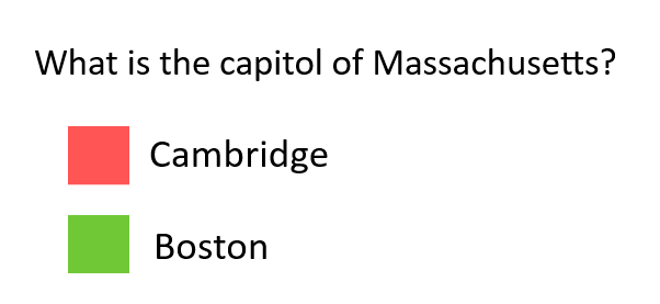
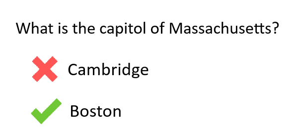
Example 2 - Use Shape Differences
In the example, a red square is used to mark incorrect answers and a green square is used to mark correct answers.
To make it accessible, we add a secondary cue (shape differences) to ensure that meaning can be understood even if our audience can't see red or green.
Note: to ensure these symbols are accessible to users of assistive tech, we would also typically add alt text to each symbol, something simple like “red x” and “green check.”
Original:
Uses color alone to indicate meaning.
Accessible:
Uses color and shape to indicate meaning.
Example 3 - Use Labels
In this example we have a line graph for Training attendance by Format from 2005 to 2025, with three lines being compared: Asynchronous, Webinar, and In-Person.
The trends show that as In-Person attendance decreased, Webinar attendance increased, and in particular there was a seismic shift for both in 2020. Additionally, we see that Asynchronous training rose gradually over time but not as notably as the other two training formats.
Original:
Uses color alone to indicate meaning.

Accessible:
Uses color and labels to indicate meaning.

Testing
- Print out your page in black and white. Does the content, information, and instructions make sense when color isn’t available?
- Read your page to someone who isn’t looking at the screen. Are they able to get all of the necessary information?
- Check your page for references to visual appearance, size, position, or orientation. Is this information provided in a way that's understandable to someone who can't see?